With the aim of changing its customers’ perception and strengthening the brand presence in the region, we developed a new visual identity that balances the business’s vision of both perfumery and pharmacy. Located in Riviera de São Lourenço, Farma Santē is a reference in well-being, health, and beauty.
Seeking to convey seriousness and trust, especially concerning medications, without losing the warmth and convenience of perfumery, we created a symbol that embodies care through its details. We incorporated concepts of sophistication, convenience, warmth, and health consciousness into the brand’s construction. The overlapping elements in its design highlight meticulous finishing details, further enhancing the establishment’s sophistication. Rounded edges and a reinforced center with diagonal lines create a sense of dynamism, directing focus on the symbol, which contrasts positively with the external structure, forming a cross.
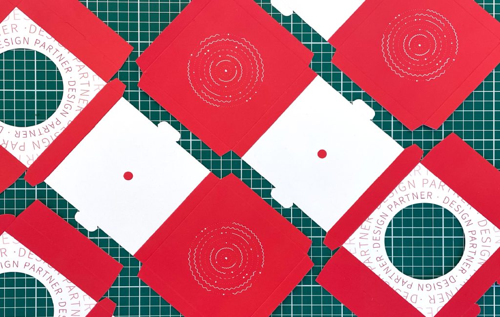
The visual universe.
To ensure this new concept, which prioritizes excellent customer service, curated product selection, and convenience blending perfumery with pharmacy, we also worked on signage, designing a new structure for the pharmacy facade. With the goal of maximizing the entire 260-square-meter storefront area, we focused on brand identification, promoting services such as delivery, and communicating with suppliers and sponsors.